Create a GIF animation of a bouncing ball using Photoshop
Introduction
This exercise will teach you how to:
- Define a gradient
- Create and specify precise attributes for a vector shape
- Create a Gradient Overlay layer style
- Use Photoshop's Gradient Editor to define a radial gradient.
- Move and position the gradient relative to the shape.
- Create a bouncing ball using Frame Animation
- Use tweening to create the frame animation
- Copy, paste, and reverse frames
- Export the animation as an animated GIF file
Required Reading
- BEFORE you start this exercise, you must first understand the basics about GIFs, GIF animation, and Photoshop:
The Exercise
Please follow these steps
- Download the 7 day trial version of Photoshop.
- NOTE that Adobe has an alternate way ("Risk Free") to get the trial version but it requires a credit card and automatically subscribes you to a one year subscription after the seven days. I assume it can be opted out of, but I'm not sure how or when. The link provided above does not require a credit card as of March 11, 2020.
- Also note that the process of opening a new Adobe account, then downloading the Creative Cloud and Photoshop apps, and then installing Photoshop took me a total of about 30 minutes.
Create a new Photoshop file and save it
- Start Photoshop CC 2015.
- Create a new Photoshop file as follows:
- Using the Photoshop menu bar select File > New >
- The New file dialog box will open.
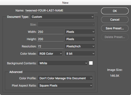
- Complete the dialog box as shown in the image. Be sure that all the items match.
- And be sure to replace the text "YOUR-LAST-NAME" that is shown in the illustration with your last name!For example I would name mine: tweened-VAUGHAN
- Click OK
- The new document steps you just took do not create a file on disk. Therefore, before you start to work, use the following steps to save the file as a Photoshop psd (Photoshop document) file.
- File > Save
- Photoshop will suggest a file name based on the name you provided in the New document dialog box. Do not change the name.
- Click OK to create the new file.
- The name of the .psd file will appear in the document's tab in Photoshop. For example, my file was named:
tweened-VAUGHAN.psd
Create a blue circle using the ellipse tool
In Photoshop, and most other graphics programs, shapes can usually be assigned a fill color and a stroke color.
- The fill is the color or pattern within the shape.
- The stroke is the outer edge, or border, of the shape.
- Note that the fill and/or the stroke may be assigned no color or pattern in which case it will be transparent, allowing whatever is behind it to be visible.
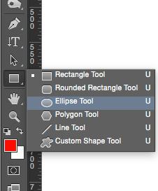
- In the toolbar, click and hold on the tool beneath the black arrow tool (see illustration below).
- A fly-out menu will appear displaying related tools that are grouped together.
- Slide over and down to select the Ellipse Tool
- After you have selected the Ellipse Tool, look at the area at the top of the Photoshop window.
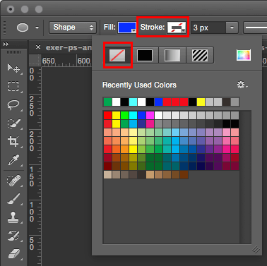
- There you will see the Options bar control panel - more familiarly referred to as the Options bar. The Options bar shows options related to the current tool or selection. Below is the options bar for the ellipse tool. Your Options bar ought to appear similarly although your colors and values are probably different:

- Click on the Fill selector. It is green in the illustration above, but probably a different color in your options bar.
- A fill chooser panel will drop down with a row of four rectangles at the top. The rectangles provide options for different fill options as shown in the illustration below:
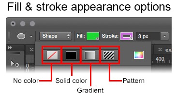
- No color - means transparent. When this is selected for the fill, the shape will reveal anything that is obscured by it, such as a background color or shape.
- Solid color - this means a plain unvarying color of your choice.
- Gradient - this allows for a fill that has varying colors. You can have one of many color variations but they are limited to either linear or radial in progression.
- Pattern - the shape can be filled with a pattern. Such patterns are available online or you can make your own. Usually such patterns must be based on images that are seamless and will look correct when tiled. More information.
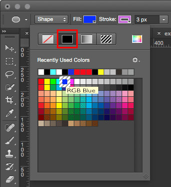
- Click on the Solid color option, which is the black rectangle labeled above.
- In the color palette area select the pure blue color swatch as follows:
- Hover over the color swatch in the color palette that has the screen hint RGB Blue as shown in the illustration below and also indicated by the diagonally patterned outline provided for illustration purposes.
- Note that the color that you select now is irrelevant to the final outcome of the exercise. This is because the gradient overlay that you will create later will appear on top of the color selected here. I ask you to do this color selection now so that you become familiar with selecting a color from a color palette and using the screen hints that are provided with it.
- Note that the color that you select now is irrelevant to the final outcome of the exercise. This is because the gradient overlay that you will create later will appear on top of the color selected here. I ask you to do this color selection now so that you become familiar with selecting a color from a color palette and using the screen hints that are provided with it.
- Hover over the color swatch in the color palette that has the screen hint RGB Blue as shown in the illustration below and also indicated by the diagonally patterned outline provided for illustration purposes.
- In the context of shapes, a stroke is the outer border, or edge, of a shape. (There are other types of strokes in Photoshop such as brush strokes). You do not want to have an outer edge for the shape because it needs to eventually look three dimensional, that is, it will need to appear to be a sphere.
- Click on the Stroke color selector (in the illustration below it is the upper red rectangle).
- The stroke chooser will open. It is identical to the fill chooser and therefore easily confused with it.
- Select the option with the red diagonal line through it, as shown in the illustration below within the lower red rectangular outline.
- The red diagonal line indicates that no color will be used - the stroke will be transparent. In practical terms this means that the circle will have no border.
- A red diagonal line will then appear in the Stroke color selector, which is indicated by the upper red rectangle in the illustration below.
- Next, using your left mouse button carefully click only once near the upper left corner of the white background of your photoshop image.
- Do not click and hold
- Do not click and drag.
- The Create Ellipse dialog opens. (see below)
- Enter a value of 100px for both the Width and the Height as shown below. (Note that an ellipse with an equal height and width is a circle.)
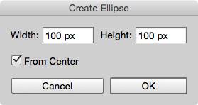
- Click OK.
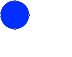
- Click on the tool that looks like a black arrow which you will find in the toolbar above the ellipse tool. It is called the Path Selection tool.
- Using it, click on your shape (but not on an edge or the very center) and then drag it into a position in the top left section of the image area, similar to what you see in the illustration below. Note that in the illustration below, the black handles (also called control points) indicate that the circle is currently selected.
Using the Layers panel to rename a layer
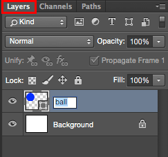
- Find the Layers panel. If you don't see it, use the Window menu to select Layers.
- In the Layers panel there ought to be a layer with the default name of Ellipse 1. This layer holds the circle shape within it.
- Double-click on the name of that layer so that you can change the name.
- The words will now have a light blue background color which signifies that whatever you type will replace that text.
- Enter a new layer name: ball as shown below:
- Be sure that your shape is selected, if it is not, use the black arrow tool to click on it to select it.
- When your circle is selected there will be black handles on the left, top, right, and bottom as is shown in the illustration above of the blue circle.
Introduction to Layer Styles
Following this brief section you will be creating a layer style. Before doing it, I want you to have some basic information about them:
- Layer Styles are a way to modify the appearance of a layer.
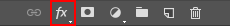
- Note that layer styles are referred by several different terms: Layer Styles, Layer Effects, Effects, and by the letters fx as seen in the button at the bottom of the Layers panel.
- The advantage of using them is that they are non-destructive - which means that they do not change the pixels in the bitmap layer(s) that they affect. The adjustment layers in Photoshop are the same in that regard.
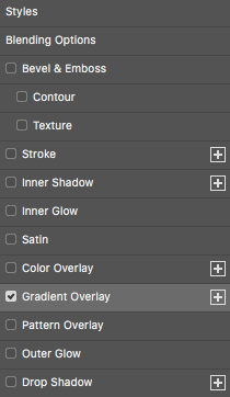
- There are several different styles that you can apply, all from the same dialog box.
- You can apply one or more layer styles to a layer.
- When a layer style has been applied to a layer its name will appear in the Layer panel beneath the layer that it affects.
- This is different than adjustment layers which are shown above the layer they affect. I speculate that the positional dichotomy is employed to make the two types of layers visually discrete.
- Layer styles can be modified easily by double-clicking on the name of one of them listed in the Layers panel.
- The Layer Style dialog box will open with information about all the layer styles applied to the layer.
- More information about Layer Styles
What is a color gradient?
A color gradient is, typically, a gradual blending from one color to another.
A linear gradient is spread in a line, in one direction. A horizontal linear gradient of the full spectrum of visible light:

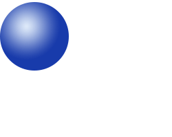
A radial gradient spreads from one point outward and evenly in all directions.
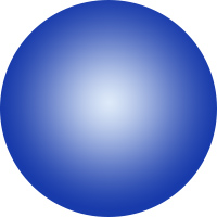
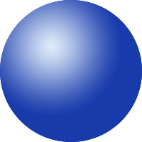
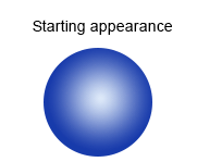
Below are examples of radial gradients that transition from an inner light blue to a darker blue on the outside edge of the gradient. Note that the following examples are very similar to what you will be creating. The circle on the left is a radial gradient that is centered relative to the shape. The circle on the right uses the same gradient but its center is up and to the left, creating the illusion of a sphere or ball.
Radial gradient radiating from the center of the circle
Radial gradient radiating from the upper left
Creating Gradient Overlay layer style
It's important that you do NOT start experimenting with layer styles until you have finished the exercise. However, I encourage you to do so in a separate file after you have completed this exercise.
- Be sure that that the layer with your circle is selected.
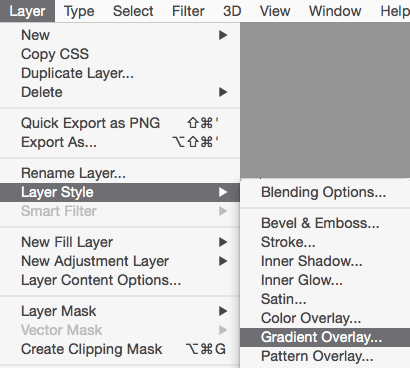
- Select in the Layer menu > Layer Style > Gradient Overlay... as per the illustration below. Another method for creating a Layer Style is to click on the fx button at the bottom of the Layers panel:
- The Layer Style dialog box will open.
- The Gradient Overlay style will be pre-selected in the left side column
- see illustration to the right →
- This column lists all of the other default Styles that are available. You will not be using any of the others in this exercise. But note that Multiple styles can be applied and edited using this dialog box. You can also save custom styles.
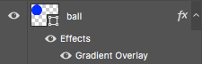
- In the Layers panel, there is now an Effects listing.
- It is here that all of the styles applied to the layer above will be listed.
- Your Gradient Overlay style is now listed there:
- Leave the Layer Style dialog box open and proceed to the next section.
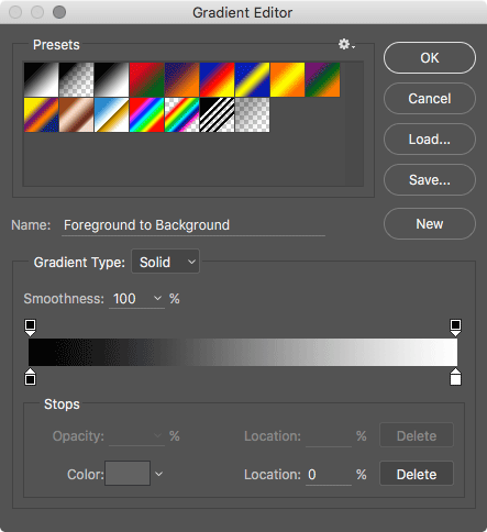
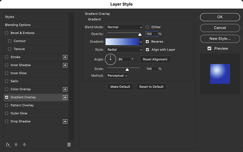
Editing the gradient
- Your Layer Style dialog box ought to be open.
- Carefully make all of the settings illustrated below.
- Note! Your Gradient sample may look different and that is OK.
- Be sure that you make all of the settings correctly.
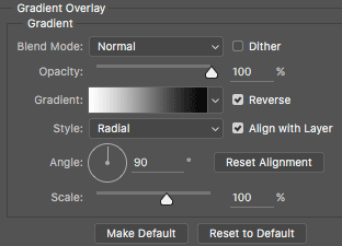
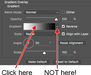
- Next, click on the Gradient sample as shown below:
- The Gradient Editor dialog box will open, shown below.
- Note that, once again, your colors may be different.
- Also, the Name field's contents may be different. The Name will change to Custom when you start to edit the gradient's colors.
- Note that at the bottom is the Stops section, discussed next.
-
About Stops
-
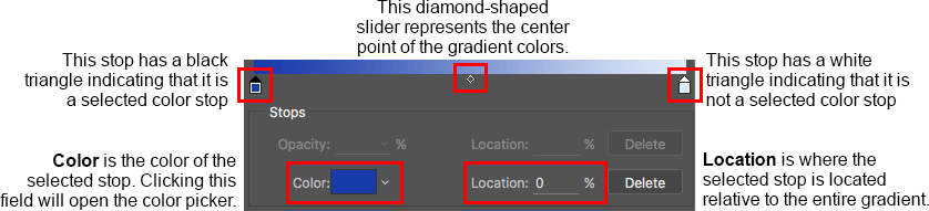
 Gradient Stops are represented by the little squares with triangles that are located above and underneath the horizontal band that represents the gradient.
 - The squares represent:
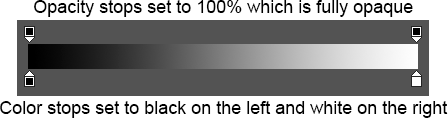
- Above the gradient they represent the opacity at that location. The opacity is represented by the following;
- white = completely transparent, that is, no color will be seen at that location in the gradient.
- black = completely opaque, meaning that the color is unaffected.
- shades of gray = partial opacity
- The stops underneath the gradient represent the color which can be seen within the stop.
- Above the gradient they represent the opacity at that location. The opacity is represented by the following;
- The value of an opacity stop is set by first selecting an opacity stop and then in the Stops area of the dialog entering a percentage value into the Opacity field. The color of an opacity stop will be black, white, or a shade of gray depending on the opacity value.
- The color value of a color stop can be changed by double-clicking on the stop which will open the dialog box: Color Picker (Stop Color).
- The triangles point to the location on the gradient where the setting of the stop takes effect.
- A selected stop will have a black triangle instead of a white triangle.
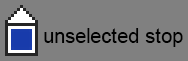
- When a stop is selected any color or opacity that you set will be applied at that point in the gradient.
- Note that the gradient is represented as horizontal linear gradient. However, it is also used to represent radial gradient settings.
- Also note that additional stops with other values can be added by clicking below or above the gradient for either opacity or color respectively.
- By default, the value of the stop will be the opacity or color at the location you click. This initial value can be easily changed using the methods mentioned above in this section.
- Any stop can be removed by click-dragging it up or down and releasing the mouse button.
- There must always be a minimum of one stop.
- The following illustration provides information about the stops used in the Gradient Editor:
-
 Set the color stops for the radial gradient that you will use as follows:
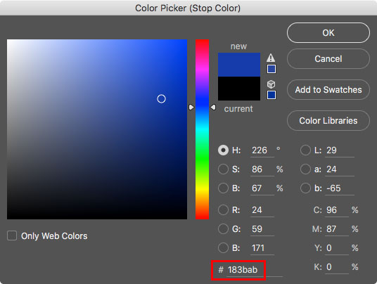
- Double-click on the stop in the lower left of the gradient bar.
- This will open the Color Picker (Stop Color) dialog (illustrated on the right).
- At the bottom of this dialog box is a field identified only by a # hash tag (see the red box in illustration) and it contains what is called a hexadecimal color code.
- The field in the illustration contains the hexadecimal code for the color used for the stop. Set the value in that field of your Color Picker to 183bab
- Then click OK.
- Next, double-click on the lower right side stop.
- Set the hexadecimal number to deeaf9
- Click OK.
- Click OK to close the Gradient Editor.
- Note: If you need to change the gradient overlay settings in the future, simply double click on the words Gradient Overlay under the word Effect in the Layer panel. Then the Layer Style dialog box will open with Gradient Overlay selected in the left column. You can then make changes.
Positioning the highlight for the ball
- Set the Method option to Perceptual.
- Your Layer Style panel ought to look something like this now:
- When this dialog box is open you can manually reposition the center point of the gradient. The center of your gradient is the lightest part.
- To move the gradient, leave the Layer Style dialog box open and have the Gradient Overlay style still selected.
- Click and hold on the gradient in your image, not the one in the dialog box.
- If you cannot see the circle in your image, move the dialog box away so that you can.
- Drag the gradient up to the left, as per this animated illustration:
- Click OK to close the Layer Style dialog box.
What are frames?
- All animations, videos, and movies consist of a series of individual, discrete images.
- Each image is referred to as a frame.
- Note that these types of frames are not the same picture frames.
- When those images, or, frames, are rapidly viewed one-at-a-time, the illusion of smooth movement can be created.
- There are certain criteria that need to be met in order to create this illusion:
- The changes in position of the objects depicted in the animation cannot be too large relative to the adjacent frames.
- If the distance is too great, a jerky, un-smooth motion will be created.
- The objects in the frames need to maintain consistent appearance, or make only gradual changes, over the course of many frames.
- There are other rules as well that you may want to learn about online.
Animation
You are now ready to create the animation. The objective is to make the ball start high on the left side, drop to the middle of the bottom, go to the upper right side, and then return back again. You will then set the animation to repeat endlessly.
- Open the Timeline panel: Window menu > Timeline
- Click the button shown below. A two item menu will appear. Select Create Frame Animation
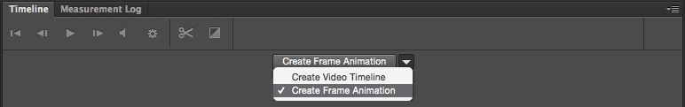
- As soon as you make that menu selection, your first frame will appear in the timeline.
- It ought to be selected as is indicated by a light gray shading around the frame's thumbnail image.
- Next, click once on the button shown below in the red box which will add an identical copy of the first frame.
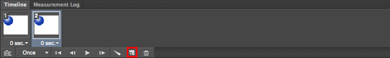
- Next, select frame 2 (it should already be selected). Again, you can tell it's selected due to the light gray shading around its thumbnail image.
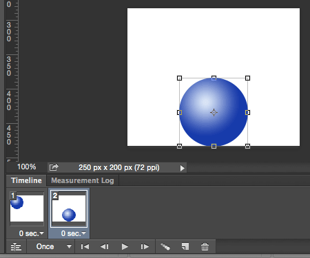
- Select the Move tool (V) at the top of the toolbar.
- Click on the ball in the main viewing area (not in the frame's thumbnail) and reposition it to the bottom center of the frame as shown in the illustration below.
- Again, don't attempt to move the ball by clicking on the frame in the Timeline - the ball needs to be moved in the main window.
- Note that when you move objects in the main window you can see the new position in the thumbnail image of the frame unless the change in position is minor.
- If you are interested, there is an option to make the thumbnail images larger:
- Click on the tiny menu button (the three bar hamburger icon) in the top far right corner of the Timeline panel and then select Panel Options...
- There you can select the size of the thumbnail images used by the timeline.
- The image below is what you ought to end up with.
- Note the two frames at the bottom of the illustration. They show the different positions of the ball in the two frames. Note that we will be adding several frames between these two frames later to provide smooth motion.
- Select both frame 1 and 2 by Shift-clicking on frame 1 (this assumes that frame 2 is already selected).
- Next, you will let the computer create frames to go in-between the two positions of the ball in the frames. This is a procedure called tweening.
- Tweening expedites the animation process by generating frames to go between a beginning and end frame.
- Click on the button shown in the small red box at the bottom of the illustration below. The tooltip of the button is also visible there. The Tween dialog box will open as shown below. Enter 3 into the Frames to Add field. Do not change the other settings:
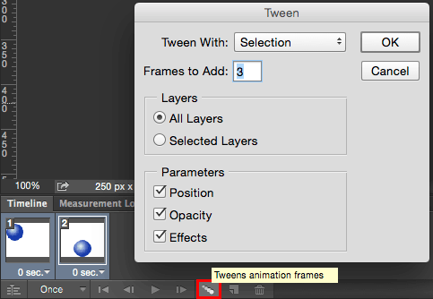
- Click OK.
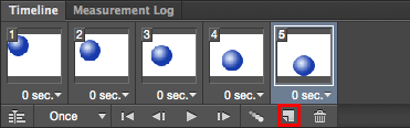
- Below is an image of what you ought to see now: five frames with perfect spacing between the positions of the balls in each frame:
- Next, be sure that only frame five is selected. Click on the new frame button, seen in the red box above.
- A copy of frame 5 has been made named frame 6 (what a surprise!).
- Select frame 6, then move the ball to the top right corner. (See frame 9 of the illustration below).
- Now shift-click on frames 5 and 6 to select them both.
- Click on the Tweens button again.
- Enter the same value of 3 frames.
- Click OK.
- Now you have added the ball bouncing up to the right.
- Select all nine of your frames by selecting the first frame, holding down the Shift key, then selecting the last frame.
- Click on the little 0 sec. menu on any of the frames.
- A menu of display time lengths is show. This menu is used to set the length of time that the selected frames will be shown.
- Select 0.1 - this will set the display time to 1/10 of a second for all of your frames as illustrated:
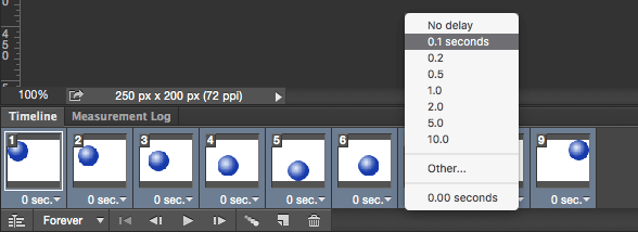
- Now click on the Once menu button in the lower left of the Timeline panel.
- Select Forever. This will result in the frames in the animation being repeated endlessly.
- Click the play button beneath the timeline and your animation will play.
- The ball is not bouncing back to the left. We will be adding that.
- You will do it by following the steps below that will instruct you on how to copy the frames between the start and end frames, paste them after the last frame, leave them selected, and then reverse their order. The result will be a ball that bounces back and forth again and again.
- Please follow the steps below to execute that procedure properly.
- Click the stop button (the square) to stop the animation playback.
- Select frames 2-8 by first clicking on frame 2, then pressing and holding down the Shift key, and then clicking on frame 8.
- Then use the small menu in the far upper right the Timeline panel and select Copy Frame, shown below:
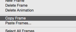
- Select your last frame, frame 9.
- Return to the same menu and this time select Paste Frames...
- The Paste Frames dialog box opens.
- Select Paste After Selection if it is not already selected, as shown below:
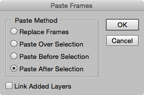
- Click OK
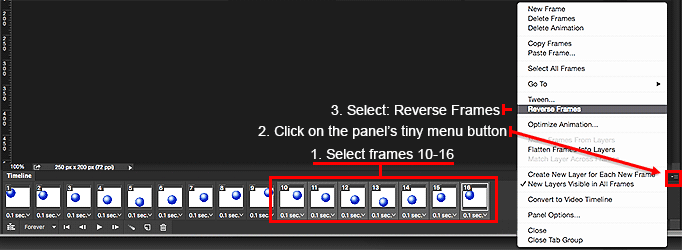
- You ought to now have a copy of those frames placed after frame 9. The new frames will be numbered 10-16. Those frames ought to be selected. Leave the frames selected.
- Once again, use the small menu button on the far right side of the Timeline panel and open its menu.
- Select Reverse Frames
This illustration shows the three steps you just took:
- Play the animation and it ought to look satisfactory.
- You may want to select all the frames and set the frame rate to 0.1 sec. to speed it up. I think that will provide much more satisfactory results.
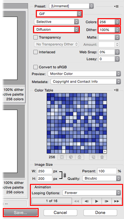
Export the animated GIF
- The last step is to export the animation as an animated GIF.
- File > Export > Save for Web (Legacy)...
- Make the same settings as you see in the red boxes in the illustration to the right.
- But note that it does not matter what frame of the sixteen is shown in the Animation section on the bottom.
- If you want to, take another look at your amazing animation using the play button near the bottom.
- Click the Save button to save your animated gif file using the name automatically provided, which is the same name as your photoshop file but with the .gif file extension at the end.
- Save the animated gif file to a location where you can find it again. Perhaps you want to use the same location as the Photoshop file.
- Now be sure to File > Save your Photoshop file.
- Create a folder named tweened-YOUR-LAST-NAME (replace YOUR-LAST-NAME with your last name!)
- Put both your .gif file and your .psd file into that folder.
- Compress the folder as a .zip or .rar file.
- Submit the compressed file.
Below is the absolutely phenomenal result - it was certainly worth all the effort...right?
For more information:
Photoshop Help / Create timeline animations
Photoshop Help / Create frame animations
Create an animated GIF in Photoshop