Anti-Aliasing Examples
Note that anti-aliasing is not an issue with the SVG (scalable vector graphics) image file type which is becoming increasingly mainstream. SVG defines shapes mathematically of with code. However, SVG has some limitations. Embedding text into images is not always ideal. But adding shapes and letters to bitmap (raster) images (images that are made up of pixels) is often unavoidable. This addresses those situations.
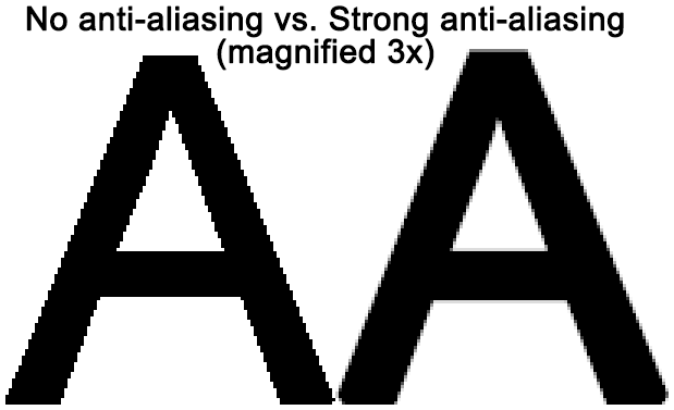
The term aliasing refers to the jagged edges that are the result of the corners of individual pixels (tiny color squares that images consist of) that can be seen on the edges of curves and diagonal lines. The image below shows two letter A's magnified three times their actual size in order to accentuate their edges. At 100% size the effects are still somewhat apparent, as you can see in the image at the bottom of this page.
The letter A on the left has very jagged edges on its diagonal edges but not on the horizontal edges. The horizontal edges are not jagged because the top edges of the pixels on those edges are also horizontal.
The letter A on the right has "Strong" anti-aliasing applied to it. Anti-aliasing creates a blend between the background color and the color of the letter. It is being applied to all edges. This results in the edges being slightly blurred. This can create the illusion of smoother edges when seen at 100% size.
There are many different algorithms used for anti-aliasing. Photoshop offers four in its Character panel as you will see below.
Note:
- The anti-aliasing being discussed herein uses text as an example. Aliasing also affects shapes that are added to an image including ovals, rectangles, arrows, and so forth.
- HTML text is anti-aliased in other ways.
- Text that appears to be part of an image on a web page is very often HTML text on top of a CSS background image.
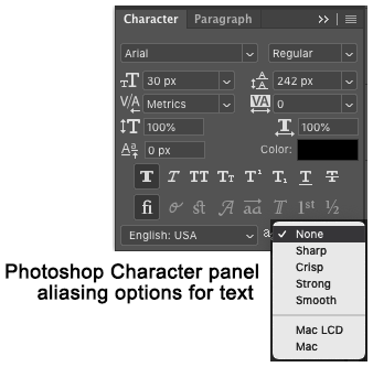
The image below is the Character panel in Photoshop CC 2019. At the bottom right corner of the panel is a menu of five algorithm options for controlling the aliasing of selected letters. The result of each option is shown in the image at the bottom of the page at 100% size, but also with a much larger font.
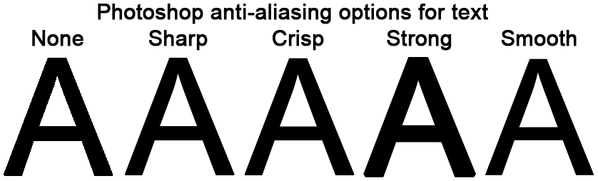
The letters below are at 100% size. The letter on the left has no anti-aliasing applied. There are jagged bumps on its diagonal edges (refereed to as jaggies), although they are less apparent than in the example image at the top of this page of the non anti-aliased letter that is magnified 3x.
However, if you compare non-anti-aliased letter below on the left with the four anti-aliased letters to its right you will probably conclude that one or more of the anti-aliased letters are an improvement. I like the Crisp and Smooth settings. The strong setting makes the letter look too big.
Note that there is no correct setting as they are all compromises. The best option will depend on the font, its size, and subjective opinion.
For any project you work on it is a good idea to determine the font and the algorithms to use for different font sizes so that appearance can be consistent.