Using the blue channel as a mask
This exercise demonstrates how to use the blue channel's values to enhance an image. The blue channel is used to add contrast to, and brighten, the blue parts of the image. This will affect any colors that have blue in them. Using color channels as the basis for a mask is a common practice.
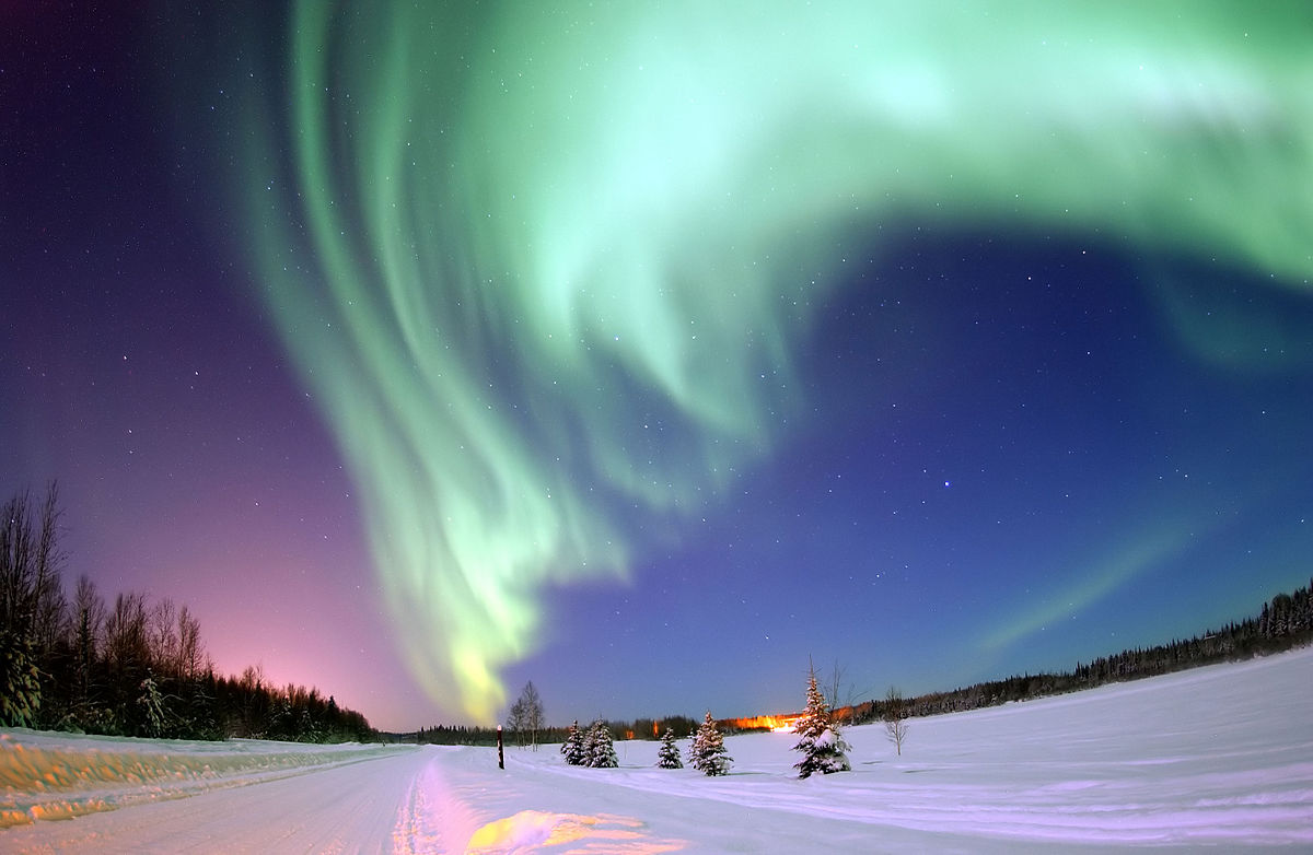
- Download this jpg file and save it: 1200px-Polarlicht_2-CC.jpg
- Open it in Photoshop.
- Save the jpg file as a Photoshop file as follows:
- File > Save As...
- The Save As dialog box will open.
- Near the bottom of it use the Format menu to select Photoshop. This will save the jpg file as a .psd file (PhotoShop Document) - the native file format of Photoshop.
- Name your file:
- masks-01-yourlastname-yourfirstname.psd
- Change yourlastname-yourfirstname to YOUR last and first names!
- For example, I would name my file:
- masks-01-vaughan-daniel.psd
- masks-01-yourlastname-yourfirstname.psd
- Name your file:
- Next (see illustration on the right):
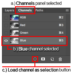
- Open the Channels panel: Window menu > Channels
- Select the Blue channel.
- This channel shows the areas of the image that have most blue in them as brighter and those without.
- At the bottom of the panel click the dashed-circular icon button, as illustrated.
- This is the Load channel as selection button.
- It creates a selection of the colors that have blue in them.
- You will use this selection to restrict subsequent image adjustments to affect only those areas of the image that have blue in them.
- You will now see the "crawling ants" (flickering lines) that represent the edge of the selected area.
- Note that the selection actually has a soft edge that is representative of the gradual changes of color.
- When a selection has a soft edge, the selection line is about half way between the totally selected area and the unselected area.
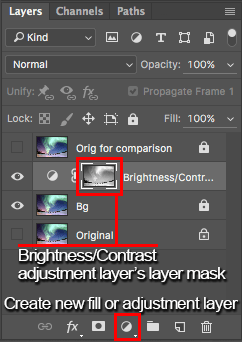
- Select the Layers panel. (See illustration on right)
- You don't need to do the following bulleted items, but you may be interested.
- In the illustration there are two copies of the original image layer. These copies are named:
- Original for comparison at the top.
- Original at the bottom.
- The "eye" icon has been turned off by clicking on the eyes for those layers. This means that the contents of those two layers will not be seen.
- In addition, there is a padlock icon on each of those two layers. This prevents the layers from being modified. The padlock was set by using the padlock icon button directly above the list of layers.
- I use the top layer to be able to rapidly compare the original image with the work I've done which is beneath it. I do this by clicking the top layer's eye icon on and off. This will show the original image vs. the modified image.
- The bottom original image is a back-up that I use in case I need to revert to it.
- You can create these layers if you want to but you must remove them before you send me your file.
- At the bottom of the Layers panel click on the icon with the black and white circle divided by a diagonal line (see illustration). This is the Create new fill or adjustment layer button
- From the menu that appears of available adjustment layers, select Brightness/Contrast.
- A Brightness/Contrast adjustment layer will be added above the background image layer.
- A layer mask will be added to that new adjustment layer.
- The layer mask is automatically created whenever a new adjustment layer is created, but it will be empty unless there is a selection when the adjustment layer is created.
- The mask that gets created now is based on the selection made from the blue channel.
- This mask will allow adjustments to colors that have blue in them (such as blue, white, cyan.
- In the new Brightness/Contrast adjustment layer, double-click on the icon of the circle with the diagonal line through it (see illustration below).
- This will open the Properties panel for the adjustment layer with the Properties tab selected (see below). Near the top left of the Properties panel, be sure that the Brightness/Contrast icon is selected (not the mask icon that looks
like a dark circle in a white rectangle).
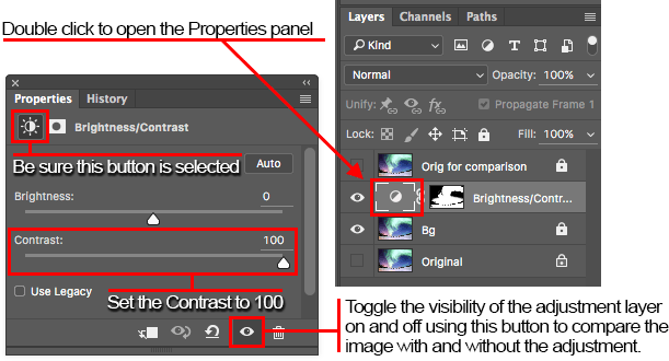
- Set the Contrast to 100. Do not adjust the brightness.
- Note that this is my opinion of how the image ought to look for this exercise, and, for the purposes of this exercise, please follow this step.
- You can experiment on a copy of your psd file. Be sure to save your exercise file before copying it.
- Compare the before and after appearance by toggling the eye icon button at the bottom of the Properties panel or on the adjustment layer.
- Here are my before and after images.
Before After
There is a subtle but noticeable increase in the intensity of the colors particularly in the purple on the left and the blue on the right:
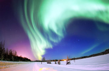
Photo courtesy Creative Commons and United States Air Force photo by Senior Airman Joshua Strang - Save your psd file.
- Submit your psd file.